Your Skeuomorph is Showing
You keep using that word, I do not think it means what you think it means.
When Alanis Morissette crooned that she had ten thousand spoons when all she wanted was a knife, it was many things but it was not, after all, ironic. This fact didn’t stop me from enjoying the album (I was in high school. I had angst.) but it did produce a generation of folks who ironically lost the ability to accurately describe their ennui. Part of me believes this is what lead to the hipster movement. Having forgotten entirely, the kids then re-discovered irony, and wore the fuck out of it like a thrift store trucker-hat.
As Apple gears up to pitch more bling today, a lot of folks are commenting on some of their recent interface design choices, which are tending towards the weirdly hyperrealistic. As demonstrated by this Apple Insider article, these critics are tossing around the word skeuomorphic like a first year design student, and while they are right to raise the alarm, I’m afraid if we’re not careful, skeuomorph will become this years irony.
Skeuomorph. It has the “keu” sound in it, but not the formal, courtly “que,” rather the squishy, slightly alien sound that we rarely encounter in English. It is fun to say, it is slightly unpleasant. It sounds like serious business. The trouble is that Apple’s unfortunate design-choices-of-late are many things, but they are (mostly) not skeuomorphic.
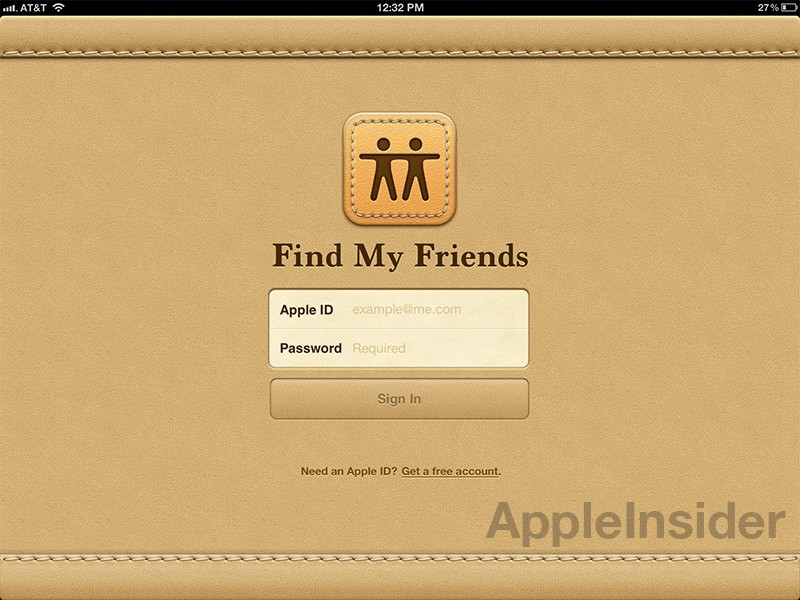
Image: Apple Insider
Skeuomorphism is a powerful tool that designers have in their arsenal. It is particularly useful for introducing the audience to a tool or idea which is “out there” in terms of what they have encountered previously. It is also useful for activating a type of nostalgia. It’s a type of metaphor that you can use to describe the operation of the unfamiliar in a kind of cultural shorthand.
Humans, like rats, are neophobic creatures, and skeuomorphism provides a comfortable transition point to an unfamiliar universe the way the presence of chain restaurants help certain Americans “survive” visits to Asia or New York.
Skeuomorphism works because of a fundamental way in which humans operate, and this is actually important: your audience will always bring their life experiences to your new, shiny interface. Thus the same effect that makes skeuomorphism a powerful design tool will come into play whether you mean it to or not This was apparently the case with the introduction of the laptop, whose keyboard so implied “low ranking female worker” that it scared the 80s alpha male executives away from purchasing the machines. (I’m not letting them off the hook, I’ve seen American Psycho, and they probably were misogynistic bastards, but mostly I think they were just lazy. They had a staff.)
The morphic after the skeuo means that we should really be looking at the physical attributes (or “physical” attributes in the case of a UI) of design, although I tend towards the inclusion of the conceptual (Photoshop is rife with these. How many of you have actually seen an unsharp mask? Have you dodged or burned a photo in your darkroom lately?). The desktop metaphor for the modern GUI is arguably skeuomorphic, in particular if the folders look like folders. The shadow under the windows is not (it is a visual device used to distinguish elements, because it turns out another thing we’re good at is sorting information in terms of depth. Blame your stereoscopic vision). Neither is the choice to make the folders look like paper or plastic (or tarantulas) skeuomorphic — it’s just a style choice.
The godawful pillowy leather on the “Friend-Finder” application reportedly mimics the stitching on the seats of Job’s private jet. This is not a skeuomorph! It does not mimic the essential design features of the Friend-Finder applications of yore. It does not reference similar tools used to locate friends, unless you happen to have a Leer on hand. It does not, in fact, reference anything at all other than (apparently) the material used to support the late Mr. Job’s backside.
So the word you are looking for is not skeuomorph, it’s “broken visual metaphor.” It’s affectation, or perhaps kitsch. It is impedance mismatch. Whatever you decide to use, it is not there because it needs to be, or once needed to be, it is there simply because someone really likes the way it looks.
The reason why this approach is so jarring from Apple is that this is a company that has worked tirelessly to demonstrate the profitability of both blank-slates and new interface paradigms: objects and interfaces which exist entirely of themselves. The multi-touch surface is a type of natural langauge interface whose existence is intended to transcend the need for skeuomorph entirely. No instructions necessary. This coupled with the minimalist aesthetic are what have made Apple such a force. Minimalism goes with everything and looks good doing it. The trouble with taking your design cues from a casino or a jet is that those materials are only familiar (and only look good) if that’s where you spend most of your time.
In all of this, what I find far more interesting from a human perspective is the thought that a man who wore the same bland outfit every day, neglected to bother with furniture and who was so irritated by the visual impact of the license plate he bought a car every six months would become so deeply enamored with virtual representations of thing-ness that he advocated baking it into the device.
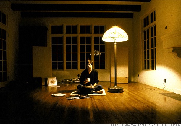
Photo: Fortune.com
It is tempting to suspect that facing the end of his life, Jobs was desperately grasping onto the material world with both hands, but I think that take is too out of synch with the legend and ultimately, like the fake leather UI, far too kitschy to be taken seriously. If anything, I suspect that if Jobs really was the driving force behind the hyper-realistic style, it was because it served to show off the achievements of the iOS device family. What hyperrealism does is first demonstrate a deep pixel craftsmanship. More importantly, if it had worked, it would have been the ultimate endorsement of the device, which is itself a sheet of glass and metal. The iPad is not a device you’d take to bed and cuddle, and yet people do, and if it were possible to make this device imply warmth and softness (like leather), then it would be the next logical step past the inflection point of natural interface. If I’m right, Jobs was simply being impatient — we are approaching that state but the inflection point has not yet been reached. In the mean time pretending it has just feels weird. Call it the uncanny-valley of the leather-metaphor.
Going forward, do me a favor and please use skeuomorph correctly. As an exercise, try the following: begin to notice the number of plastic surfaces that you encounter that are textured. Try to determine if the texture is “faux leather” (it probably is). Now notice the number of fake-leather objects you encounter on a daily basis. Ask yourself if this object was ever made of leather, and if not why the manufacturers are suggesting it could have been. Note that this exercise works particularly well if you find yourself in an American office environment (and not so well if you work at, say, IKEA), but try it, and keep asking yourself these questions, because us designers need a design literate public to keep us on our toes.